老规矩,还是先说说业务场景:有一个图片列表,可以添加、删除和更改,其中呢删除时设计给的设计稿时悬浮(hover)在图片上时显示删除的图标,所以就有了这个用before实现icon的场景
进入正文,首先我们有一张图片(这里我就用了一个随机200x200px的api):
<img src="https://source.unsplash.com/200x200" />
然后我们再到阿里巴巴矢量图标库找到一张删除的图标(我这里找了一个上传到了一个免费的图床上),接着我们用伪类把图标显示出来,值得注意的是由于img标签被认定为没有文本内容的标签,所以在给img添加伪类是无效的,所以我们需要在img外层添加一个容器,那么代码就变成下面这样了:
<div class="image-wrapper">
  <img src="https://source.unsplash.com/200x200" />
</div>
让我们加上伪类部分的内容:
.image-wrapper {
  position: relative;
  width: 200px;
  height: 200px;
}

.image-wrapper::before {
  content: "";
  width: 100%;
  height: 30%;
  position: absolute;
  display: block;
  bottom: 0;
  /* 图片来自阿里巴巴矢量图标库,仅作为学习用途,如有侵权,请联系删除 */
  background: url("https://z3.ax1x.com/2021/08/25/heU6sg.png") no-repeat
    rgba(0, 0, 0, 0.6) center/1rem 1rem;
}
下面说一下需要注意的点:
- 伪类必须要有content(conten可以为空字符串),没有content的伪类元素是不会显示的;
- content为空字符串时,伪类如果不设置display: block或者inline-block是不会显示的,因为伪类本身时inline元素,设置width和height都是无效的;
- absolute布局是相对于最近的一个非static布局的元素,如果没有就会一直向上找,直到body,所以我们需要将image-wrapper设置为
position: relative,这样图标才会相对于图片定位;
最后结合上hover,加上一个过渡动画,改变一下指针的样式:
.image-wrapper {
  position: relative;
  width: 200px;
  height: 200px;
  cursor: pointer;
}

.image-wrapper::before {
  content: "";
  width: 100%;
  height: 30%;
  display: block;
  position: absolute;
  bottom: 0;
  /* 图片来自阿里巴巴矢量图标库,仅作为学习用途,如有侵权,请联系删除 */
  background: url("https://z3.ax1x.com/2021/08/25/heU6sg.png") no-repeat
    rgba(0, 0, 0, 0.6) center/1rem 1rem;
  opacity: 0;
  transition: opacity ease-in-out .2s;
}

.image-wrapper:hover::before {
  opacity: 1;
}
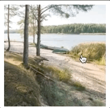
最终效果如下:
在线代码及效果:https://codepen.io/axiliya/pen/OJgPvgq?editors=1100